New UI Is Here
As we have previously informed you (via email on March 26th) about us developing a new UI look and it being available in “Preview” mode since March last week, we would now like to announce that we will be moving this new look from “Preview” to “Production” starting end of this week (week of May 4th, 2020).
Below are some details about this new look.
We are pleased to announce that for the last several months we are working on a new UI to our web application that will make the application load efficiently on all screen sizes including iPads and mobile screens. This would mean that your users will continue to experience the same functionality and process flow as they did before, but on a UI that is more efficient to use and load. And is also much better looking!
FAQs
When will this new UI be available?
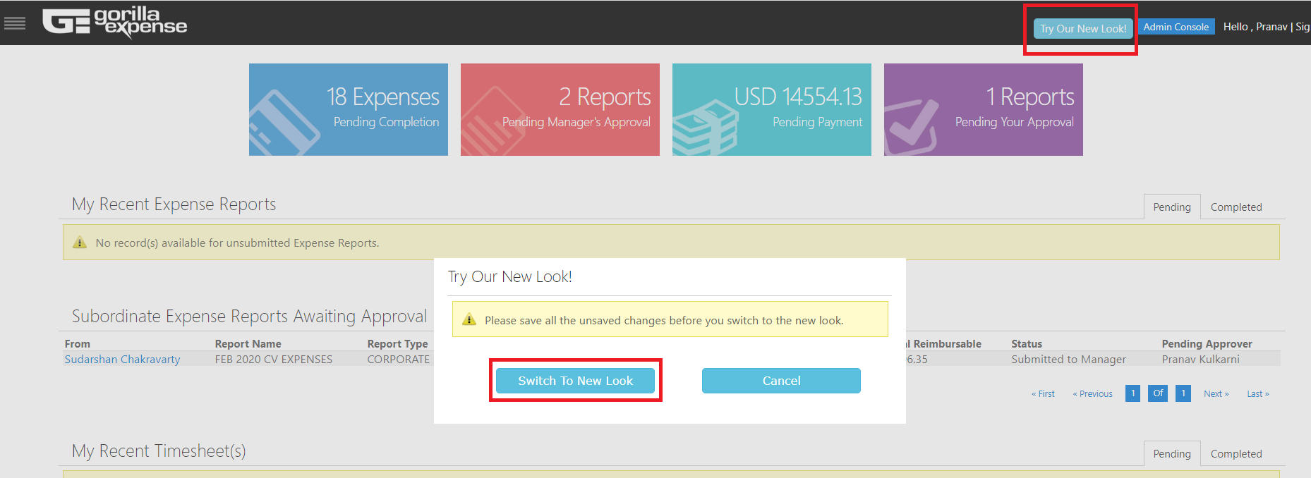
The new UI is already available in the “Preview” mode. Users have the option to access this UI (in Preview mode) by clicking on a link within their existing application. This link is called “Try Our New Look” and will be placed on the top right corner of the application (next to the ‘logout’ link).
When the user clicks on this link, the page will redirect to the UI. The next time the user logs in again into Gorilla Expense, the user will automatically be redirected to the new UI. However, the user will have the option to switch back to the existing UI by clicking on a button in the top right corner (next to the “logout” link).
We plan to switch from “Preview” mode to “Production” on 10th of May, 2020 – this way users will automatically be redirected to the new UI without having to click the “Try Our New Look” button. The existing UI will not be available from the same date.
Will there be any changes to the mobile app or is this limited only to the web application?
This is limited only to the web application. The Mobile App UI remains the same. Also, initially, the admin side of the web application will remain the same (as it is today) and will be upgraded by March-end.
Should we try the new UI?
Yes, we would strongly encourage you to have a small group of users within your organization try the new UI out and provide us with any feedback if possible. If you help us give feedback upfront then when we retire the existing UI, there will not be any surprises when your users are by default redirected to the new UI.
Will we have to retrain our users?
No. However, you should forward this email to them.
The changes are very limited with respect to layout and button & field positioning. Our primary focus has been to make the UI load more efficiently on smaller sized screens and to make the UI look better than it did. However, we do anticipate the following enhancements for the end-users
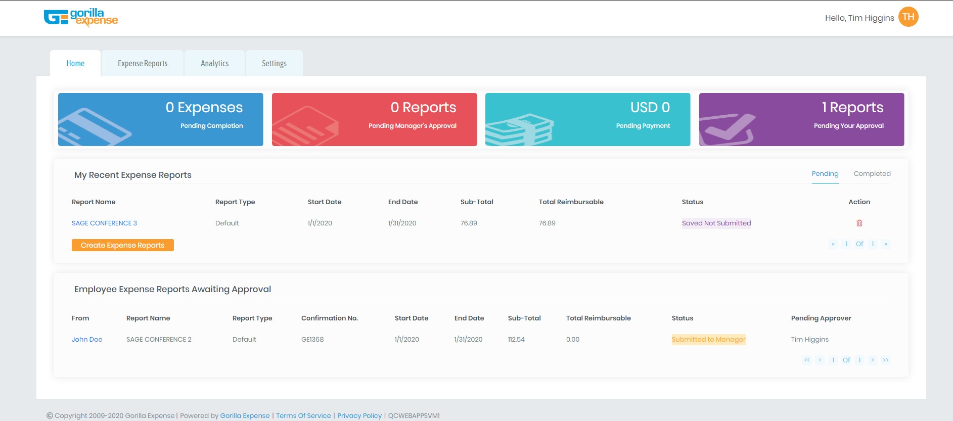
1) The menu is no longer hidden. Earlier, the menu was hidden on the top left corner and used to pop out upon clicking the top left corner. The menu was also a vertical list. Now the menu is arranged horizontally and will be present on all the screens – making navigation easier.
2) Some of our customers are already used to seeing the “Dashboard Tiles” section. See the first picture below. But if you did not see these tiles before, now you would. The four colorful tiles signify the following –
- Blue Tile – Number of expense lines pending to be attached to an expense report
- Red Tile – Number of reports pending your Manager’s approval
- Green Tile – Total amount from the already approved reports pending payment (Including corporate credit cards)
- Purple Tile – Total reports pending user’s approval (if the user is an approver)
Menu & Dashboard
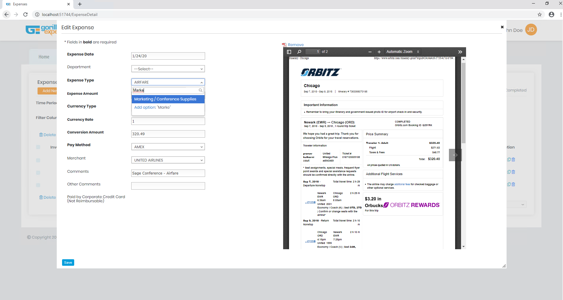
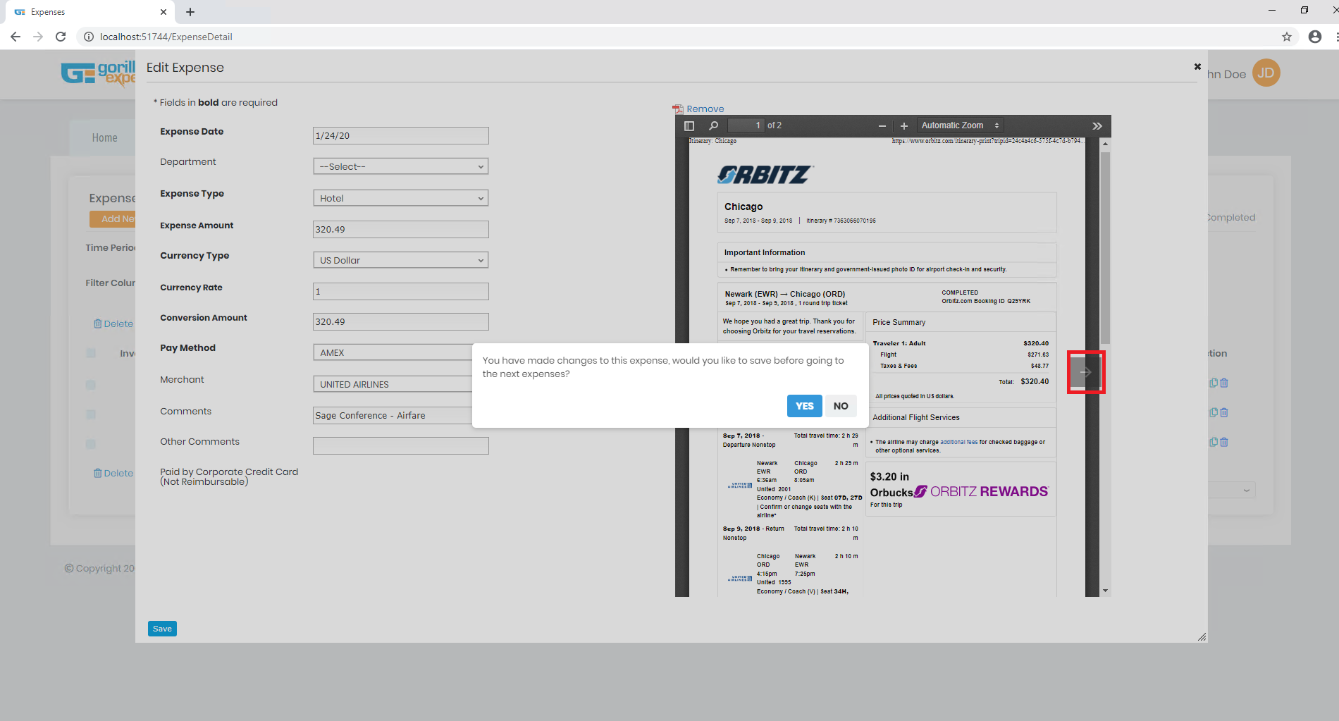
3) Adding/Editing an expense transaction is now super easy!
- While in edit mode, you get to see the receipt next to the data entry fields.
- All dropdowns are now searchable! Start typing, instead of scrolling.
- You can move from one expense line to another by clicking an arrow. No longer will you need to save the expense line, close the popup and then open another expense line (after waiting for the page to reload).
Edit Expense Screen
Any other screens that have changed?
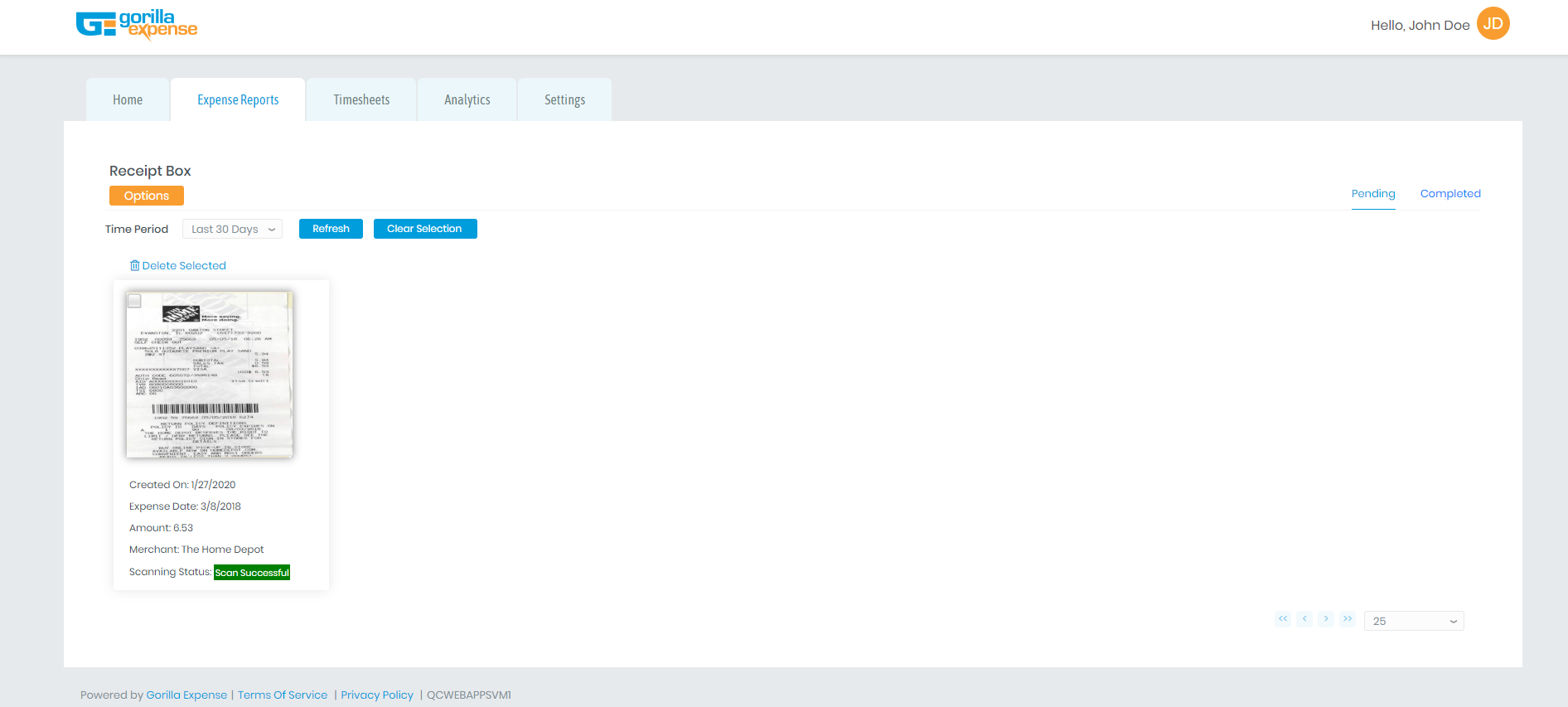
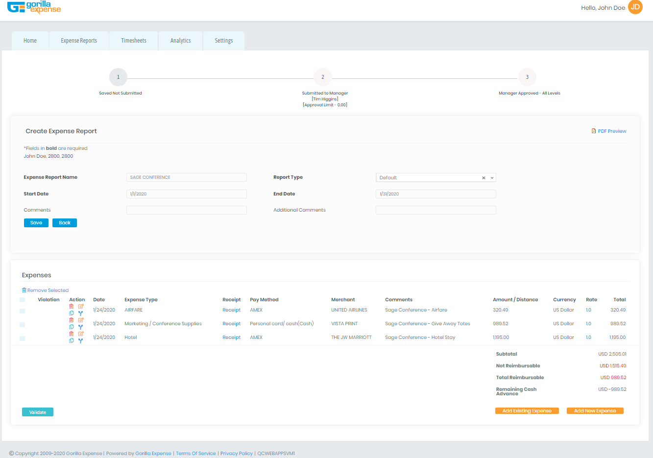
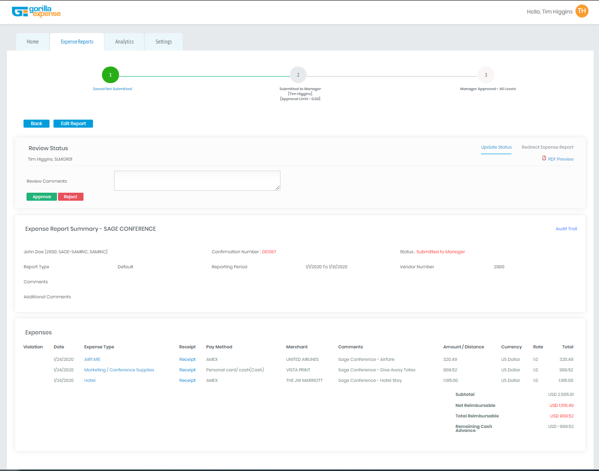
The rest of the screens remain the same – now they are just way nicer looking! Below are the screenshots from the Create Expense Report, Review Expense Report and Receipt box screens to show how (similar) they will look
Receipt Box Screen
More Questions?
If you have more questions, please feel free to email us support@gorillaexpense.com


